Role
Role
UI/UX Design, UX Research, Interview
UI/UX Designer · Visual Designer · User Researcher
Timeline
Timeline
Mar 2024 - July 2024
Mar 2024 - July 2024
Pennypal
Pennypal
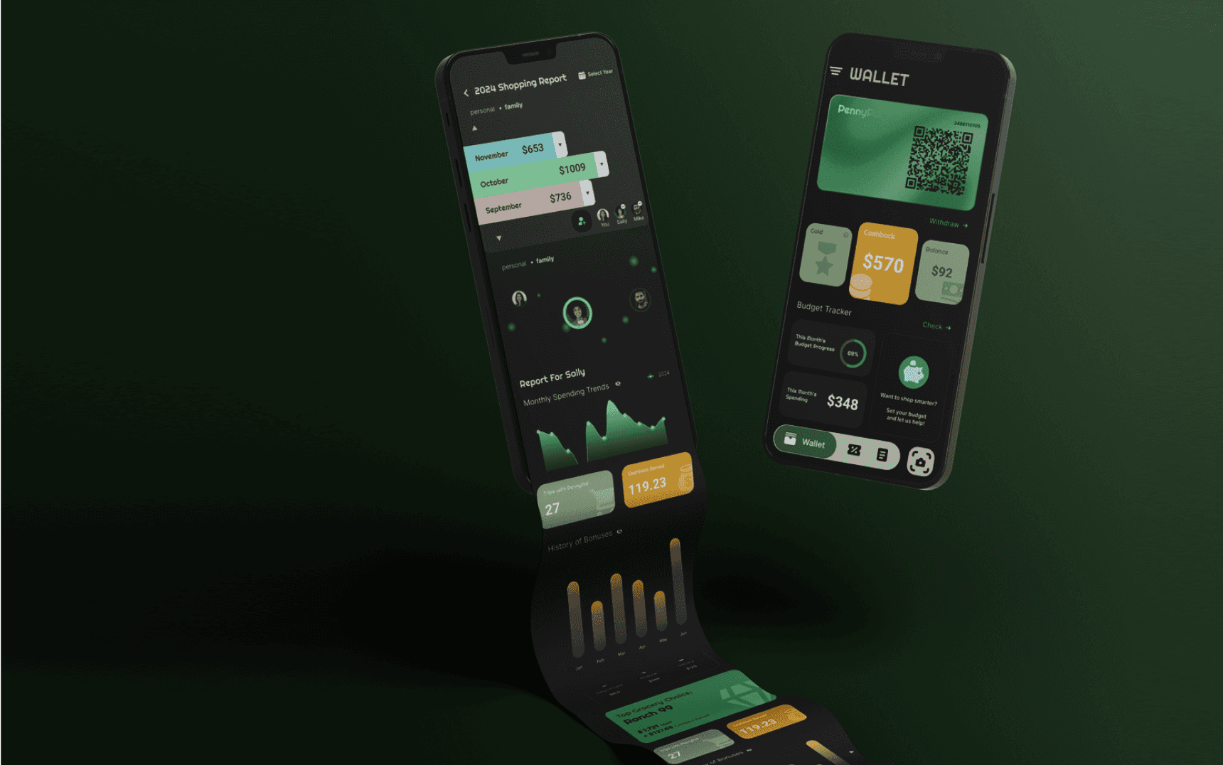
Smarter grocery experience
—solo or shared, planned and rewarded
Smarter grocery experience
—solo or shared, planned and rewarded
about the project
about the project
Empowering smarter grocery spending
through budgeting and cashback
Empowering smarter grocery spending
through budgeting and cashback
PennyPal began with a simple realization: despite our efforts to plan, my partner and I were still overspending—over $2,000 in one month alone. We didn’t lack willpower—we lacked visibility and a shared system to manage groceries together.
To understand if this was a broader issue, I interviewed 10 people from different household setups. Most echoed the same frustration: grocery spending felt unpredictable, and most tools were built for solo use or tied to specific stores—making shared planning nearly impossible.
In high-cost cities like the Bay Area, this isn't just a budgeting hiccup—it’s a real, underserved need. That insight led to PennyPal: a shared grocery budgeting app that helps people track expenses, stay accountable, and spend smarter—together.
UX Research
UX Research
0.1
Initial Design
0.1
Initial Design
0.2
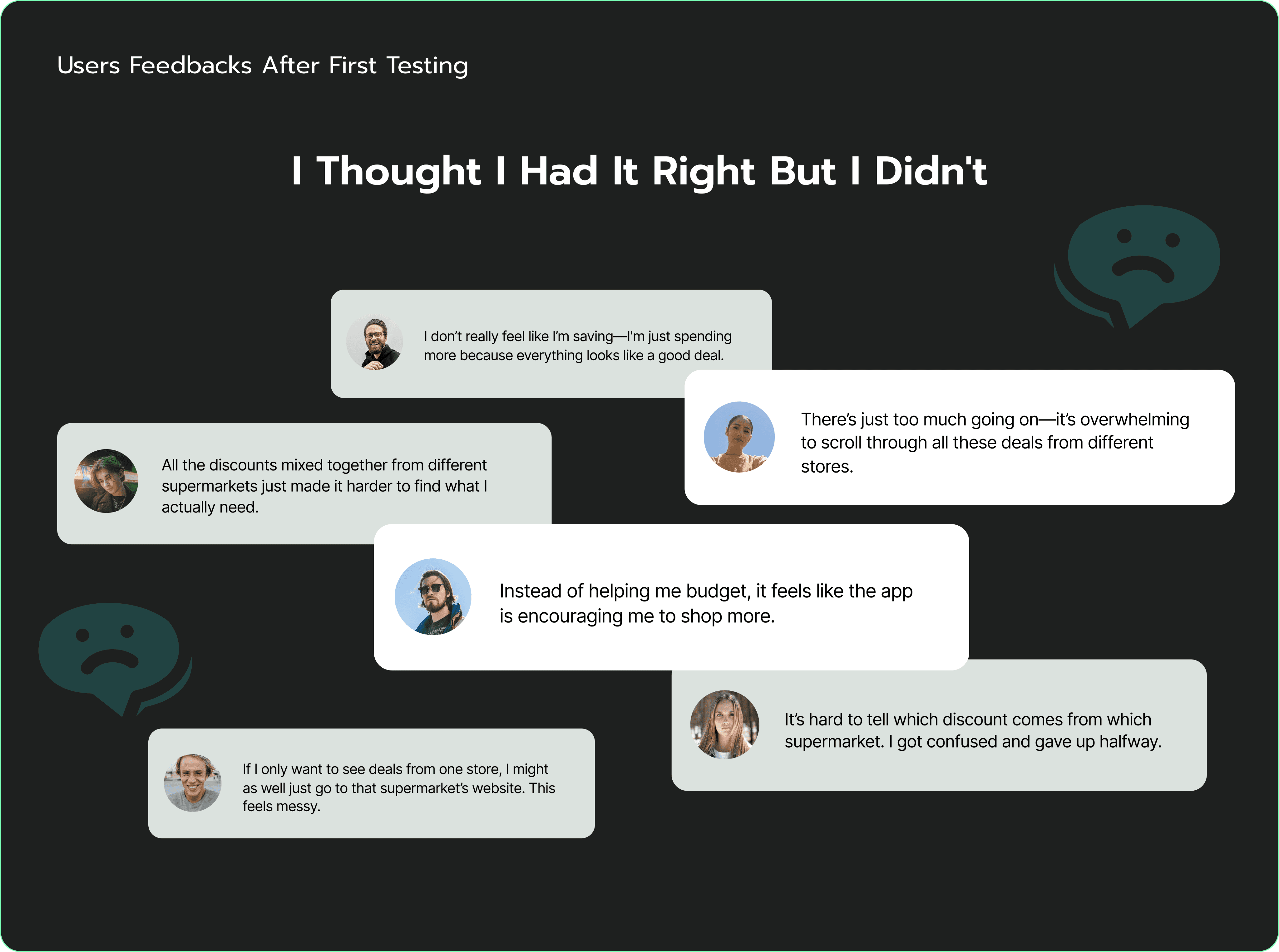
Users Feedbacks After First Testing
0.2
Users Feedbacks After First Testing
Early on, I assumed that helping people find grocery discounts was the most direct way to reduce overspending.
That assumption shaped my initial survey—many of the questions focused on discount behavior, rather than leaving space for open-ended insights.
Unsurprisingly, users responded in kind: most said they wanted easier ways to access deals, which led me to explore a discount aggregator concept.
0.3
Pivoted The Focus
0.3
Pivoted The Focus
Rethinking the Real Problem..
Rethinking the Real Problem..
Early exploration focused on aggregating grocery discounts—based on the assumption that saving money started with finding better prices. But once usability testing began, it became clear: price wasn’t the core issue.
Users weren’t overwhelmed by a lack of deals.
They were overwhelmed by a lack of visibility, shared tracking, and spending structure.
This shifted the design focus entirely—from helping people spend less, to helping them understand and manage how they spend.
UX Design
UX Design
0.1
Prioritisation
0.1
Prioritisation
0.3
Second Interview Takeaways
0.3
Second Interview Takeaways
People struggle to...
People struggle to...
Project Goals
Project Goals
avoid impulse purchases.
manage shared expenses with roommates or family.
keep track of receipts and item-level spending.
avoid impulse purchases.
manage shared expenses with roommates or family.
keep track of receipts and item-level spending.
People Need...
People Need...
an all-in-one tool to set budgets, receive alerts, and track spending.
a unified way to track purchases across supermarkets.
a shared platform to manage and review household grocery expenses.
shop smarter and get the most value out of every purchase.
an all-in-one tool to set budgets, receive alerts, and track spending.
a unified way to track purchases across supermarkets.
a shared platform to manage and review household grocery expenses.
shop smarter and get the most value out of every purchase.
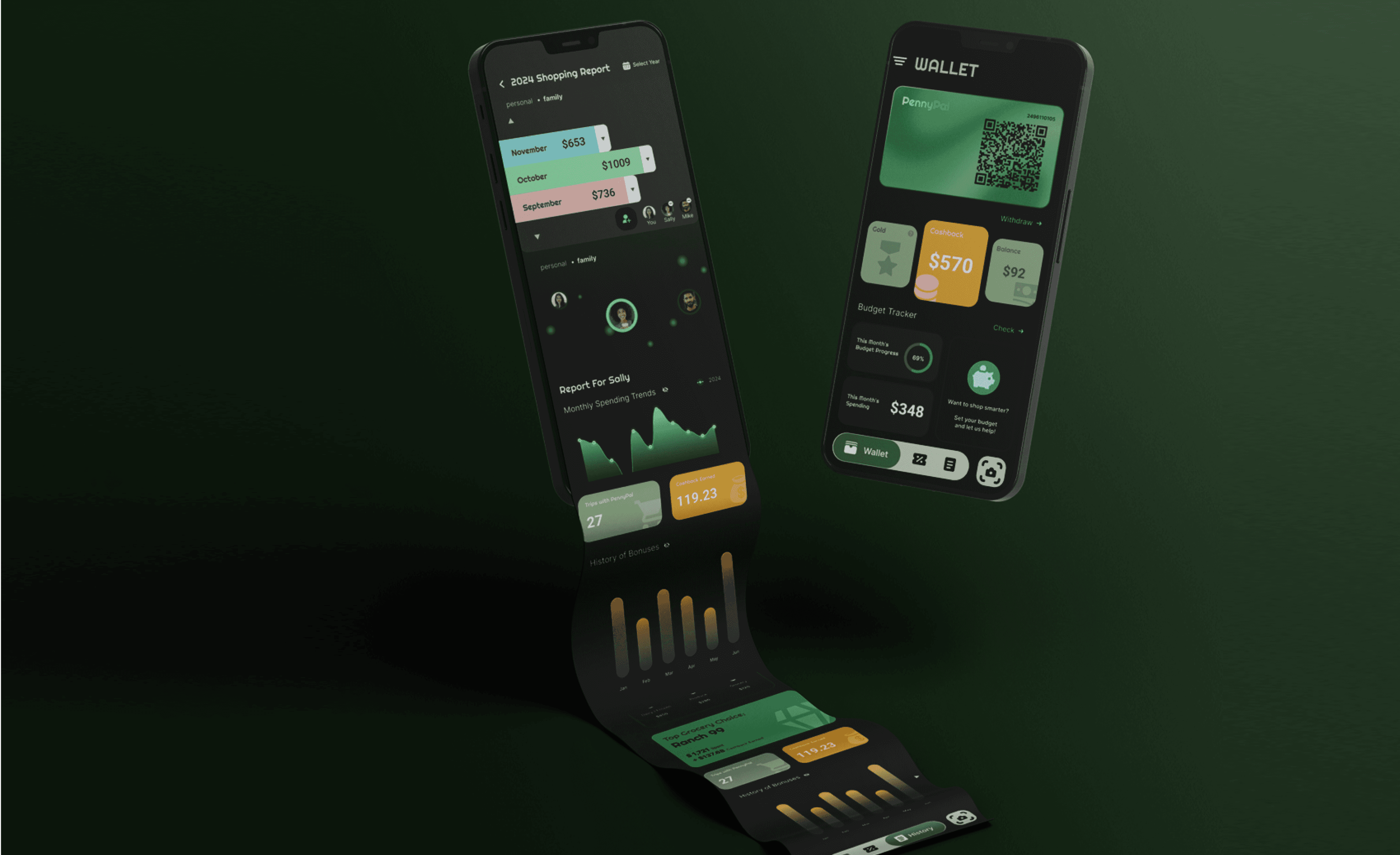
Two ways to stay in control:
budget it, then earn it back.
Two ways to stay in control:
budget it, then earn it back.
Plan itemized grocery budgets in advance, get spending reminders, and collect withdrawable cashback from partner stores.
Plan itemized grocery budgets in advance, get spending reminders, and collect withdrawable cashback from partner stores.

Simplifying household grocery costs
through shared visibility
Simplifying household grocery costs
through shared visibility
Centralizes grocery spending data to support transparency, and collaboration within shared households.
Centralizes grocery spending data to support transparency, and collaboration within shared households.


“All the discounts mixed together from different supermarkets just made it harder to find what I actually need.”
“All the discounts mixed together from different supermarkets just made it harder to find what I actually need.”
“There’s just too much going on—it’s overwhelming to scroll through all these deals from different stores.”
“There’s just too much going on—it’s overwhelming to scroll through all these deals from different stores.”


“Instead of helping me budget, it feels like the app is encouraging me to shop more.”
“Instead of helping me budget, it feels like the app is encouraging me to shop more.”
UX Design
UX Design
0.1
Prioritisation
0.1
Prioritisation
0.2
Main Function
0.2
Main Function
0.3
Supporting Features
0.3
Supporting Features
With the end of the research phase, it was time to define the essential needs for PennyPal and prioritize the core features to develop. I first aligned both business and user goals. The common ground between them can be summarized into three key points:
With the end of the research phase, it was time to define the essential needs for PennyPal and prioritize the core features to develop. I first aligned both business and user goals. The common ground between them can be summarized into three key points:


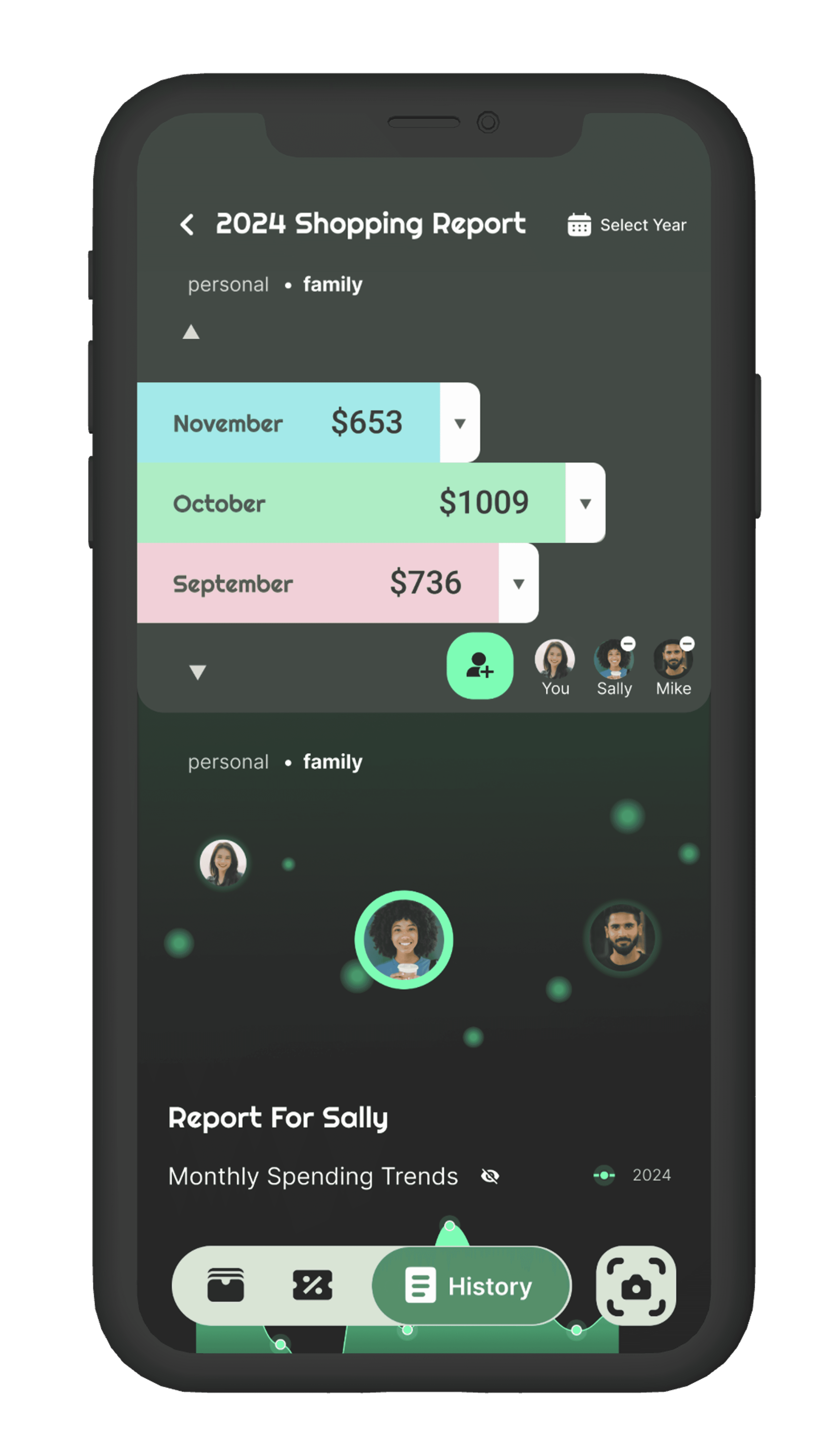
1 Family Grocery Budget Management.
The flow covers switching between personal and household views to manage shared grocery expenses.
1 Family Grocery Budget Management.
The flow covers switching between personal and household views to manage shared grocery expenses.

2 Personal Grocery Spending Management.
The flow covers setting a monthly grocery budget and tracking past supermarket spending through electronic records.
2 Personal Grocery Spending Management.
The flow covers setting a monthly grocery budget and tracking past supermarket spending through electronic records.

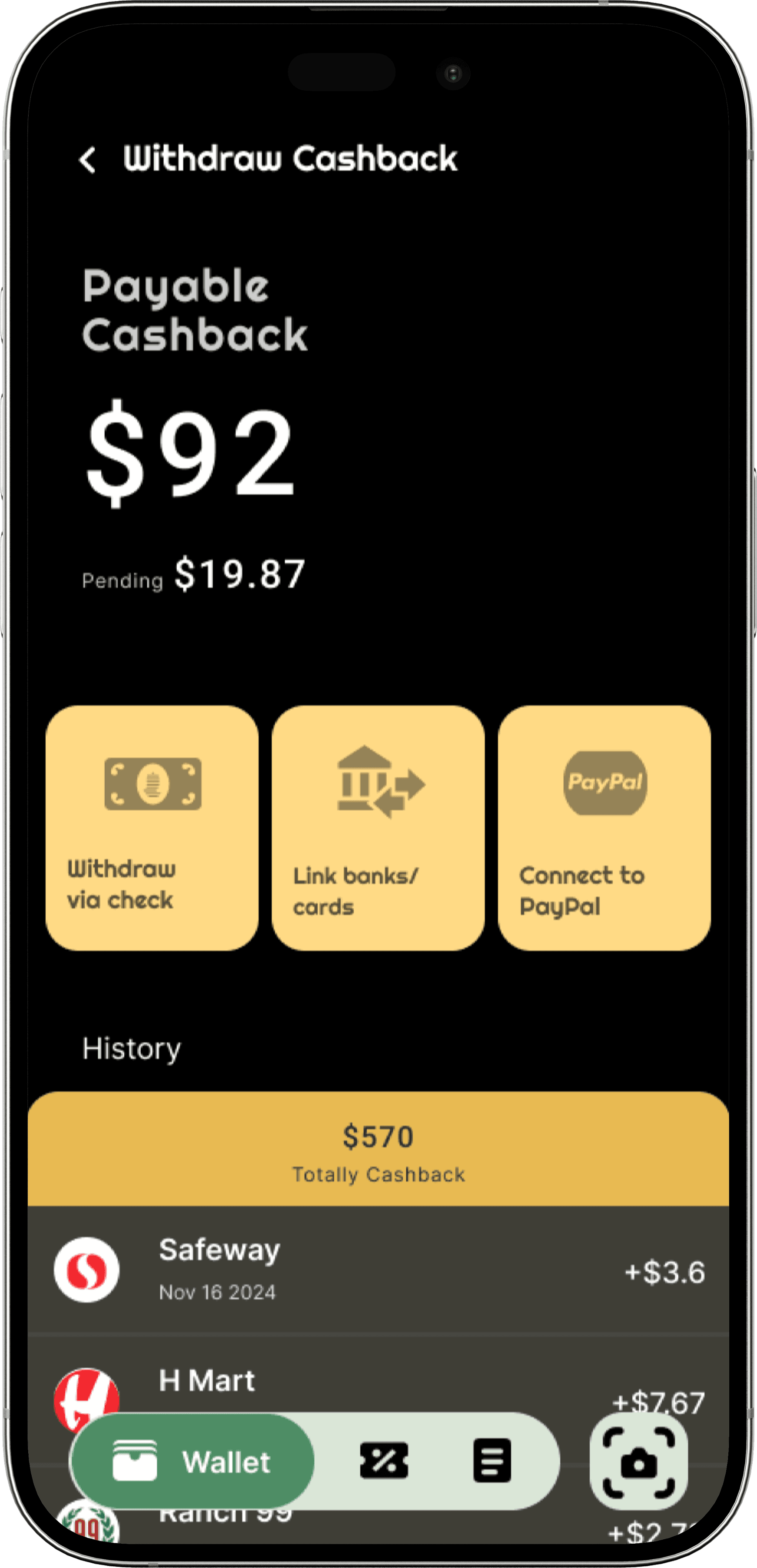
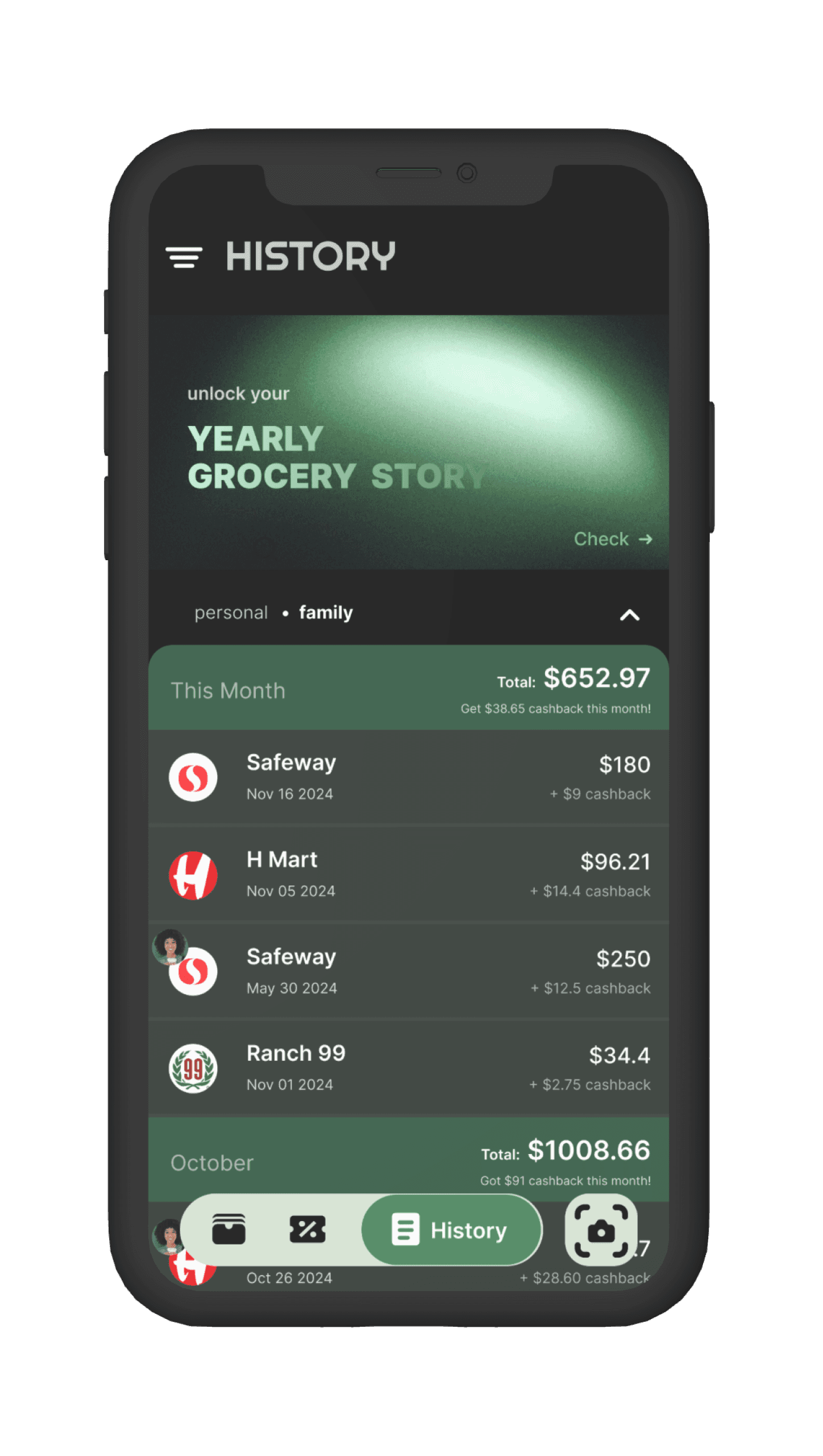
3 Cashback Management and Withdrawal.
The flow covers viewing earned cashback and withdrawing through preferred methods.
3 Cashback Management and Withdrawal.
The flow covers viewing earned cashback and withdrawing through preferred methods.

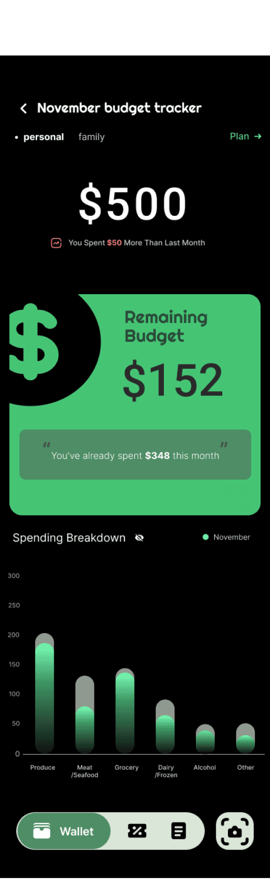
4 Overspending Alerts & Notifications
The flow covers system-generated reminders when users exceed their monthly grocery budget, helping them stay financially aware.
4 Overspending Alerts & Notifications
The flow covers system-generated reminders when users exceed their monthly grocery budget, helping them stay financially aware.
5 Manual Receipt Upload
The flow covers uploading a receipt photo when QR scan was missed, turning it into a digital grocery bill for record-keeping.
5 Manual Receipt Upload
The flow covers uploading a receipt photo when QR scan was missed, turning it into a digital grocery bill for record-keeping.

Usability Test
Usability Test
0.1
Iterations
0.1
Iterations
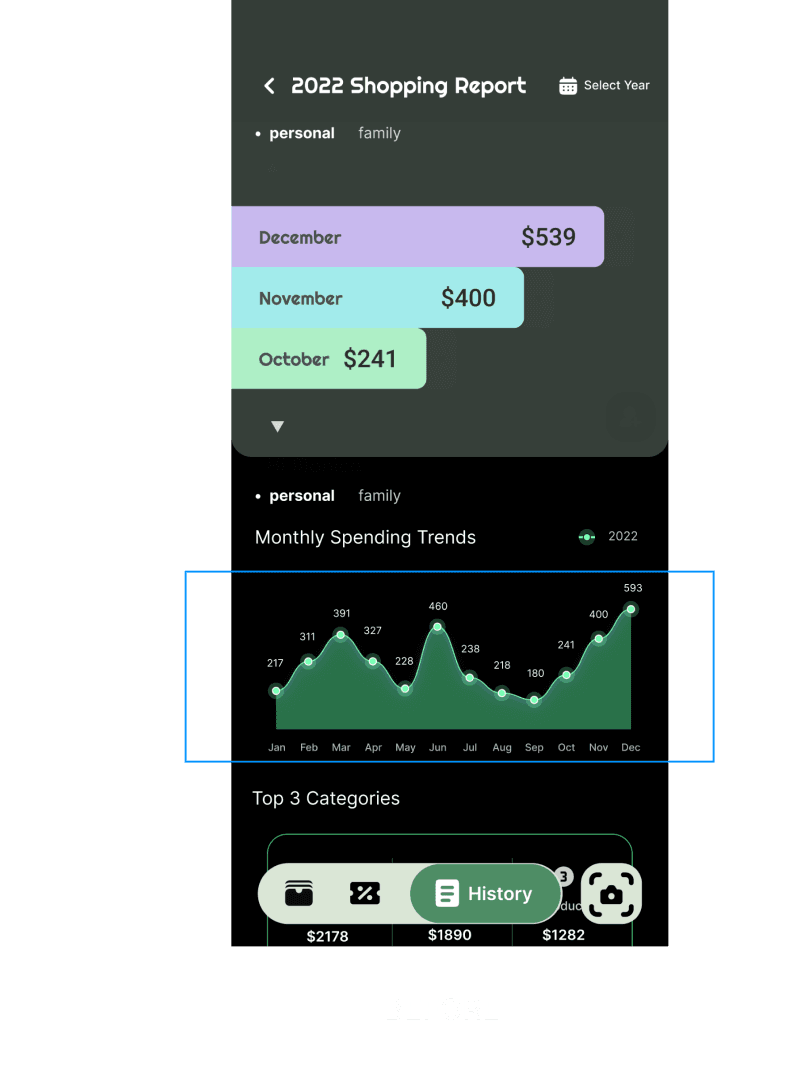
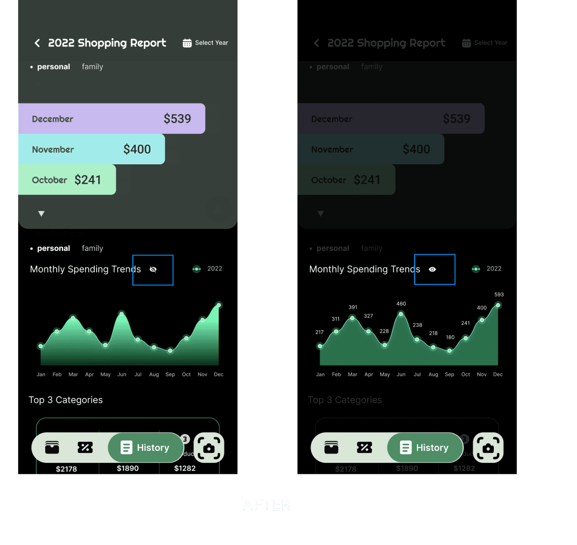
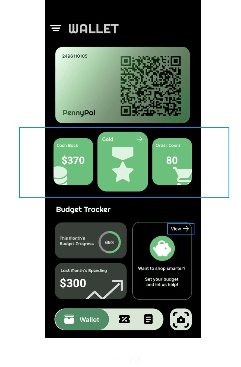
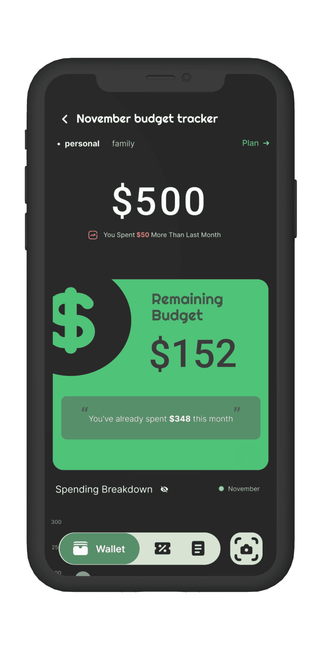
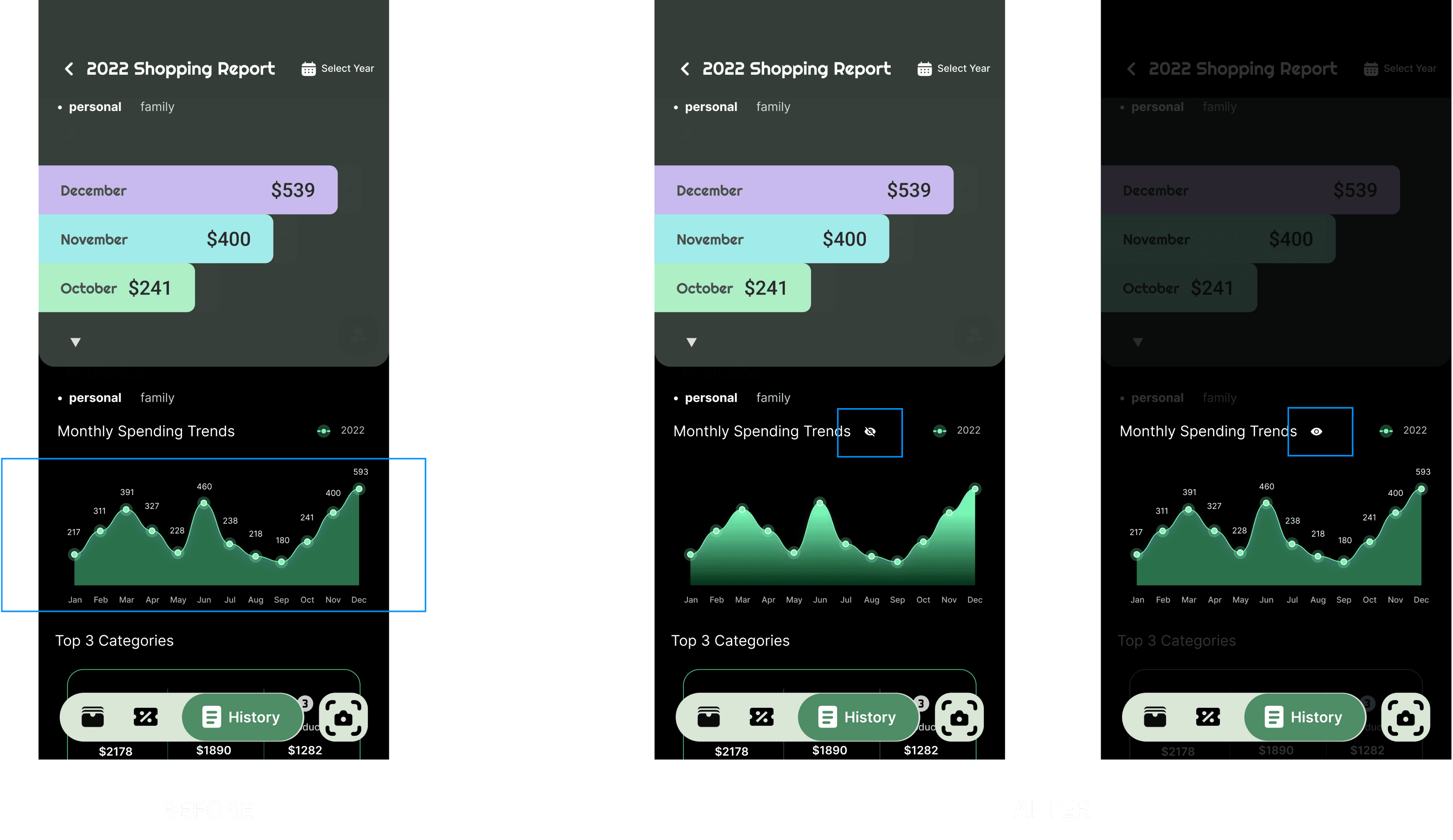
Iteration 1:
Simplify Data View with User-Controlled Toggle
Iteration 1:
Simplify Data View with User-Controlled Toggle
Feedback:
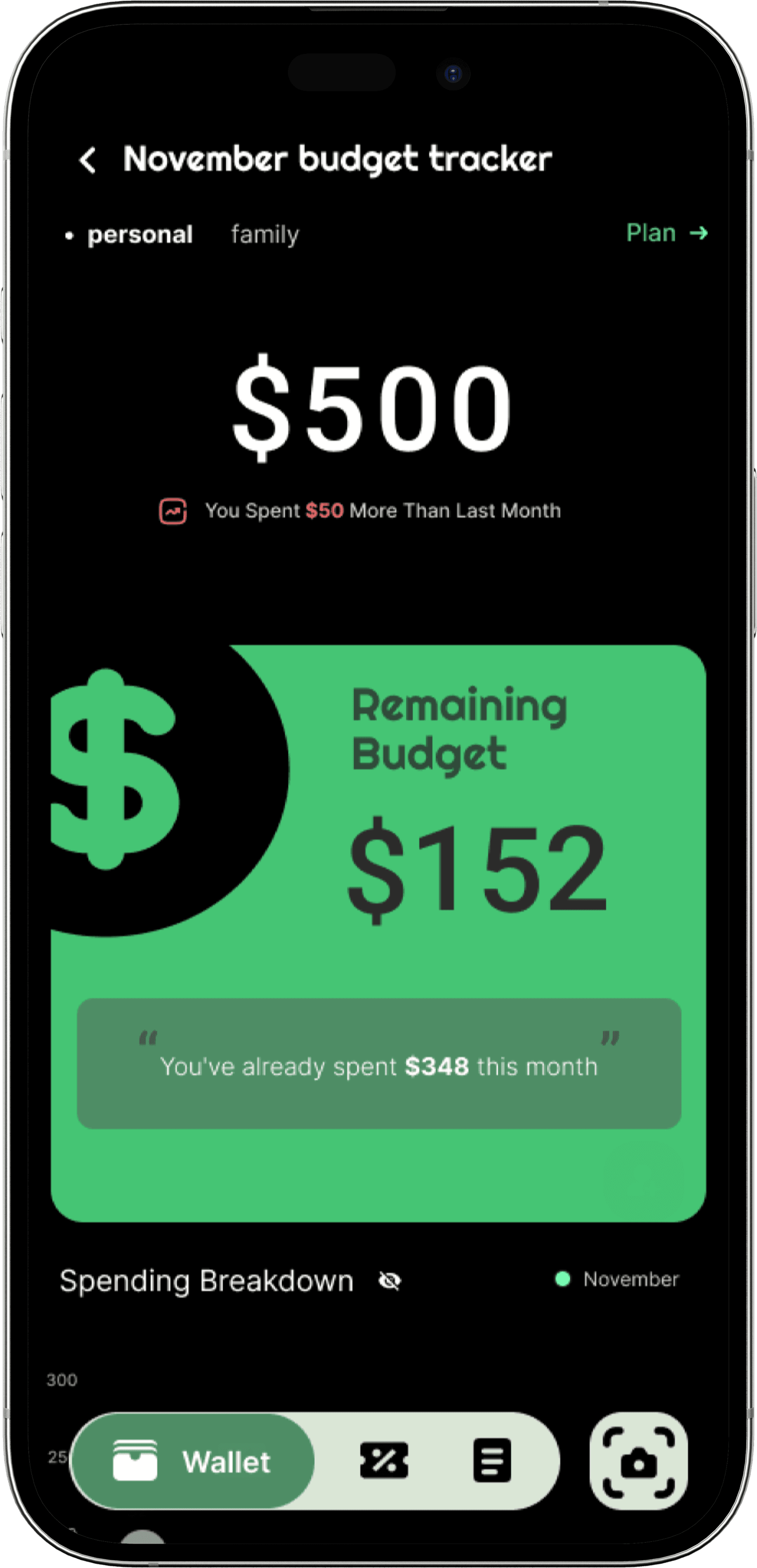
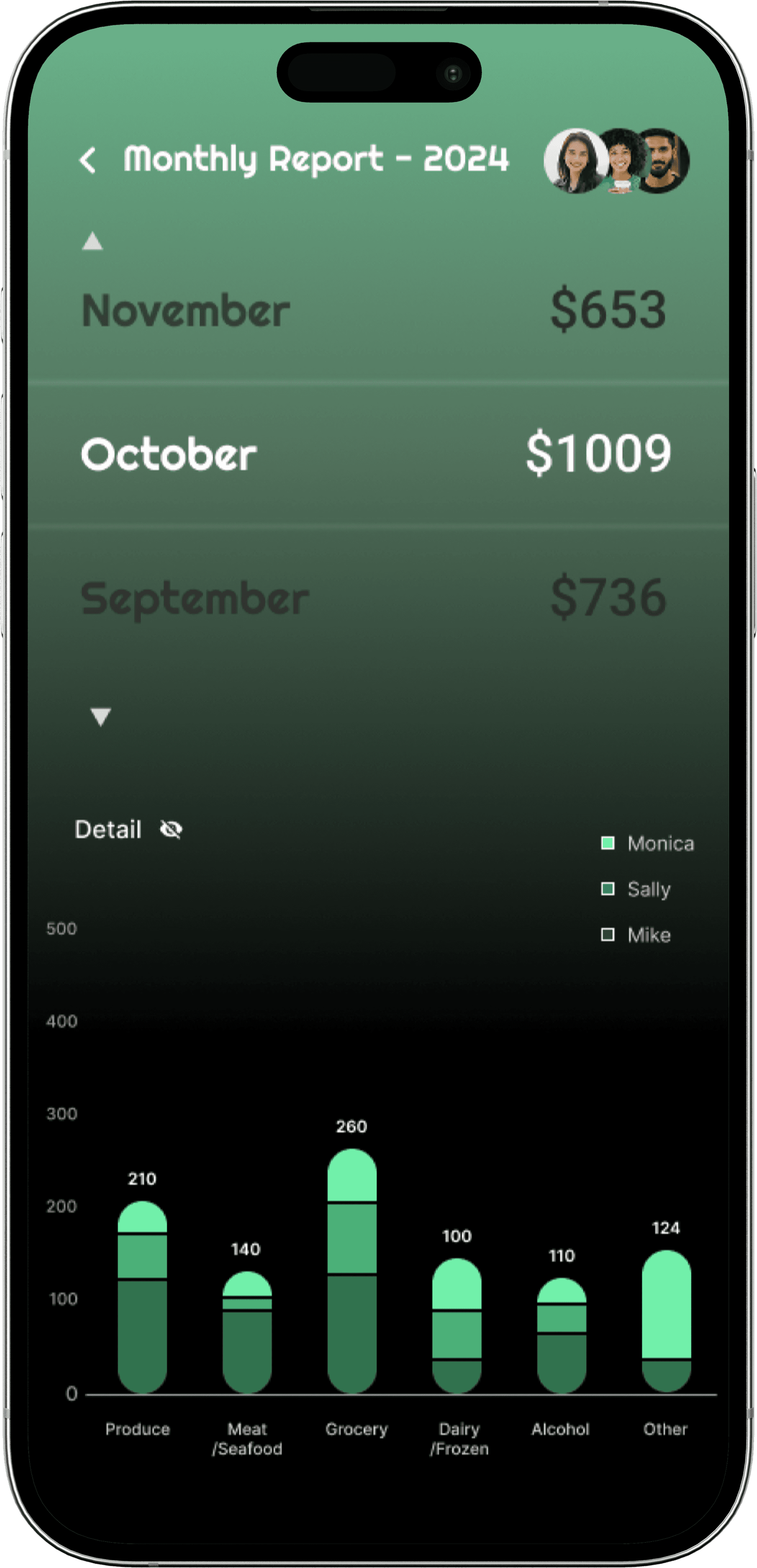
Over 65% of users found the budget overview screen visually overwhelming—citing difficulty focusing due to too much data shown at once.
Feedback:
Over 65% of users found the budget overview screen visually overwhelming—citing difficulty focusing due to too much data shown at once.
Design Change:
Introduced a detail toggle in the chart, allowing users to expand or collapse data based on preference.
Design Change:
Introduced a detail toggle in the chart, allowing users to expand or collapse data based on preference.
Result:
78% of users reported reduced cognitive load and improved ability to focus on relevant information, especially during quick check-ins.
Result:
78% of users reported reduced cognitive load and improved ability to focus on relevant information, especially during quick check-ins.
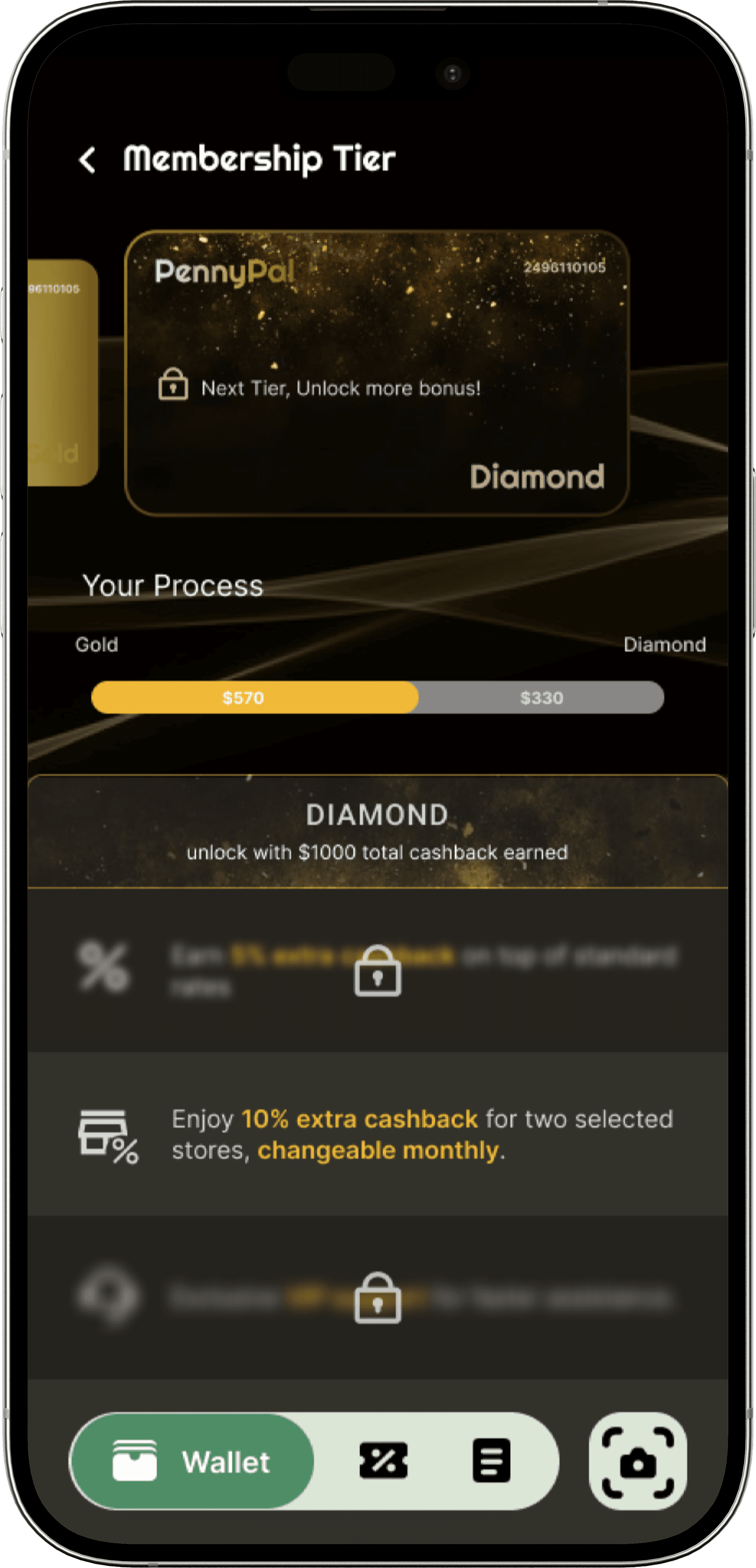
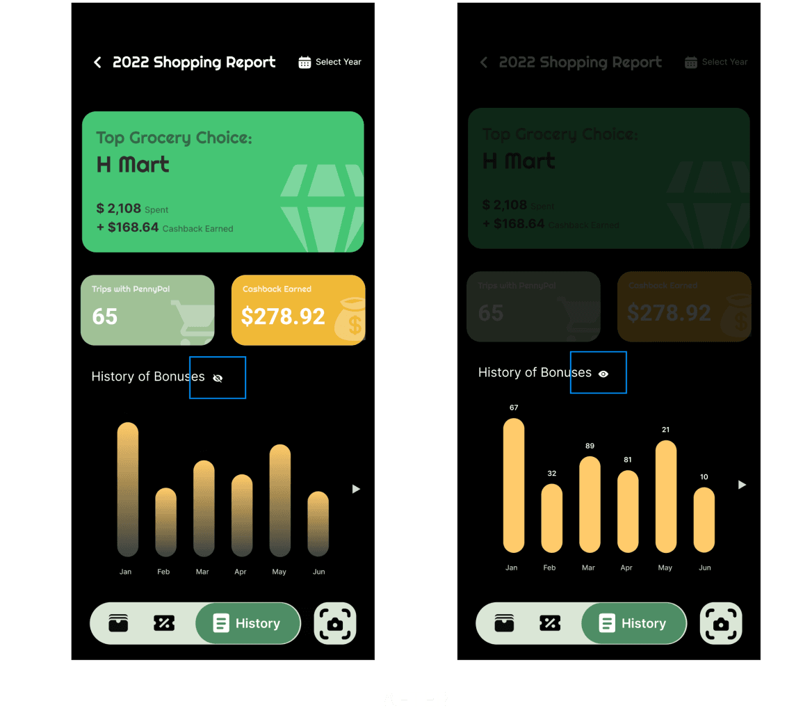
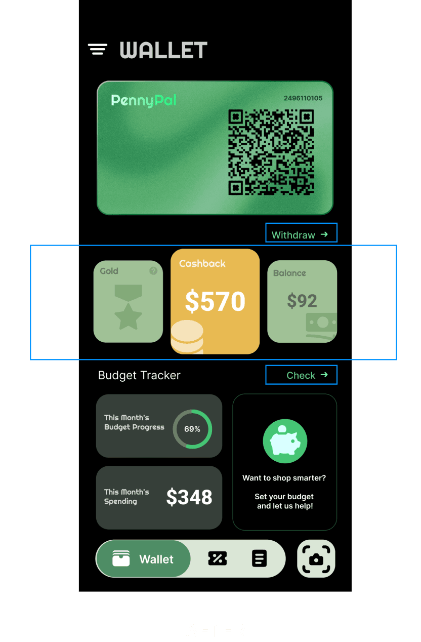
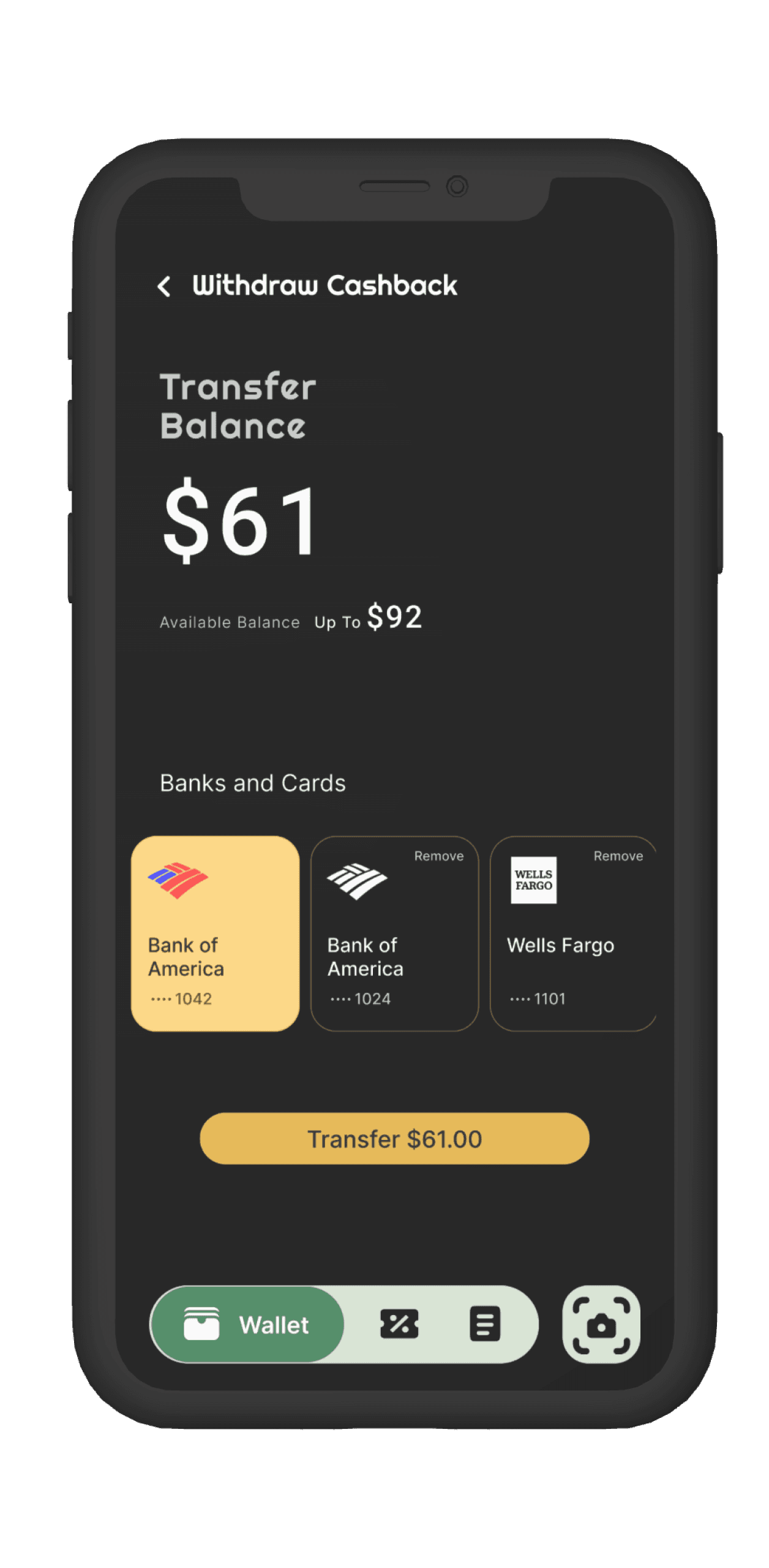
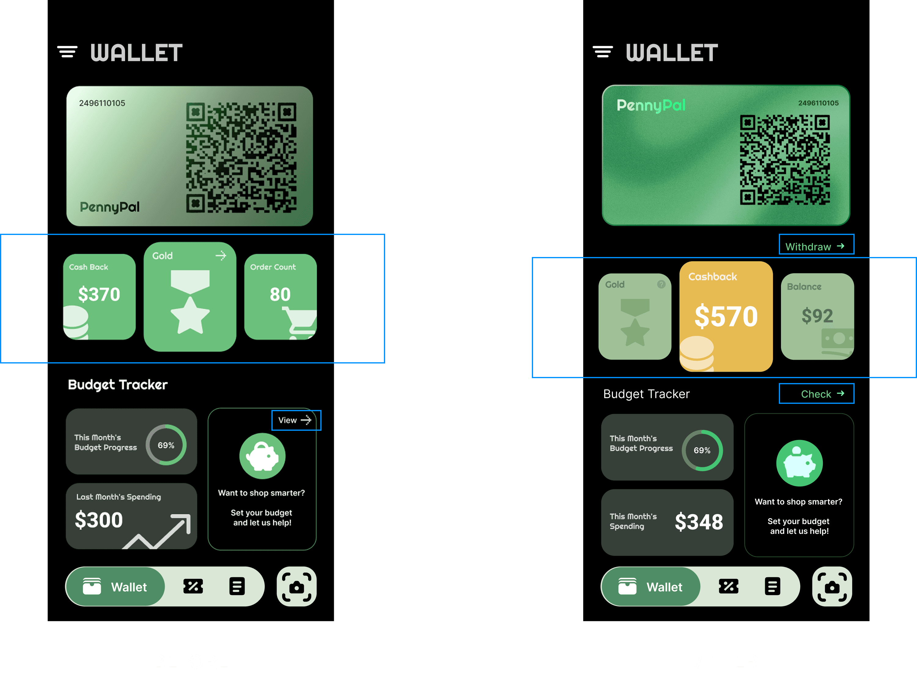
Iteration 2:
Prioritize Cashback Visibility Through Visual Hierarchy
Iteration 2:
Prioritize Cashback Visibility Through Visual Hierarchy
Feedback:
Over 70% of users overlooked key cashback details—reporting they “missed the most important part” due to poor visual hierarchy.
Feedback:
Over 70% of users overlooked key cashback details—reporting they “missed the most important part” due to poor visual hierarchy.
Design Change:
Reworked the layout by elevating cashback info on a bold gold card, de-emphasizing secondary elements like membership tier, and adding clearer CTA buttons.
Design Change:
Reworked the layout by elevating cashback info on a bold gold card, de-emphasizing secondary elements like membership tier, and adding clearer CTA buttons.
Result:
95% of users immediately noticed the cashback section post-change. Visual prioritization improved comprehension and next-step clarity.
Result:
95% of users immediately noticed the cashback section post-change. Visual prioritization improved comprehension and next-step clarity.
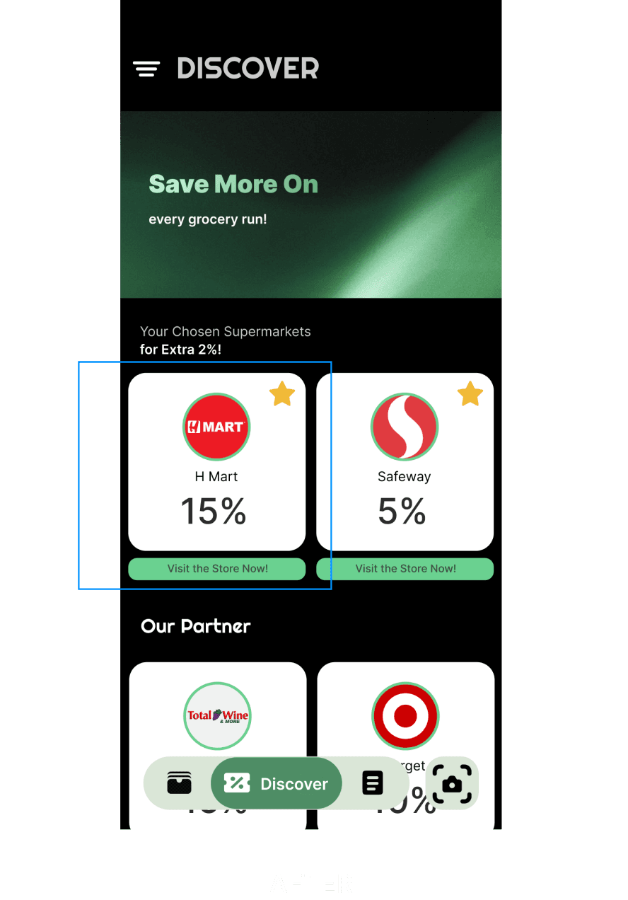
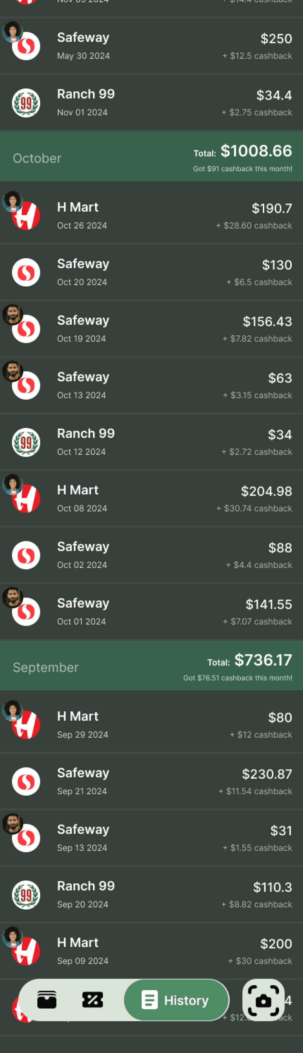
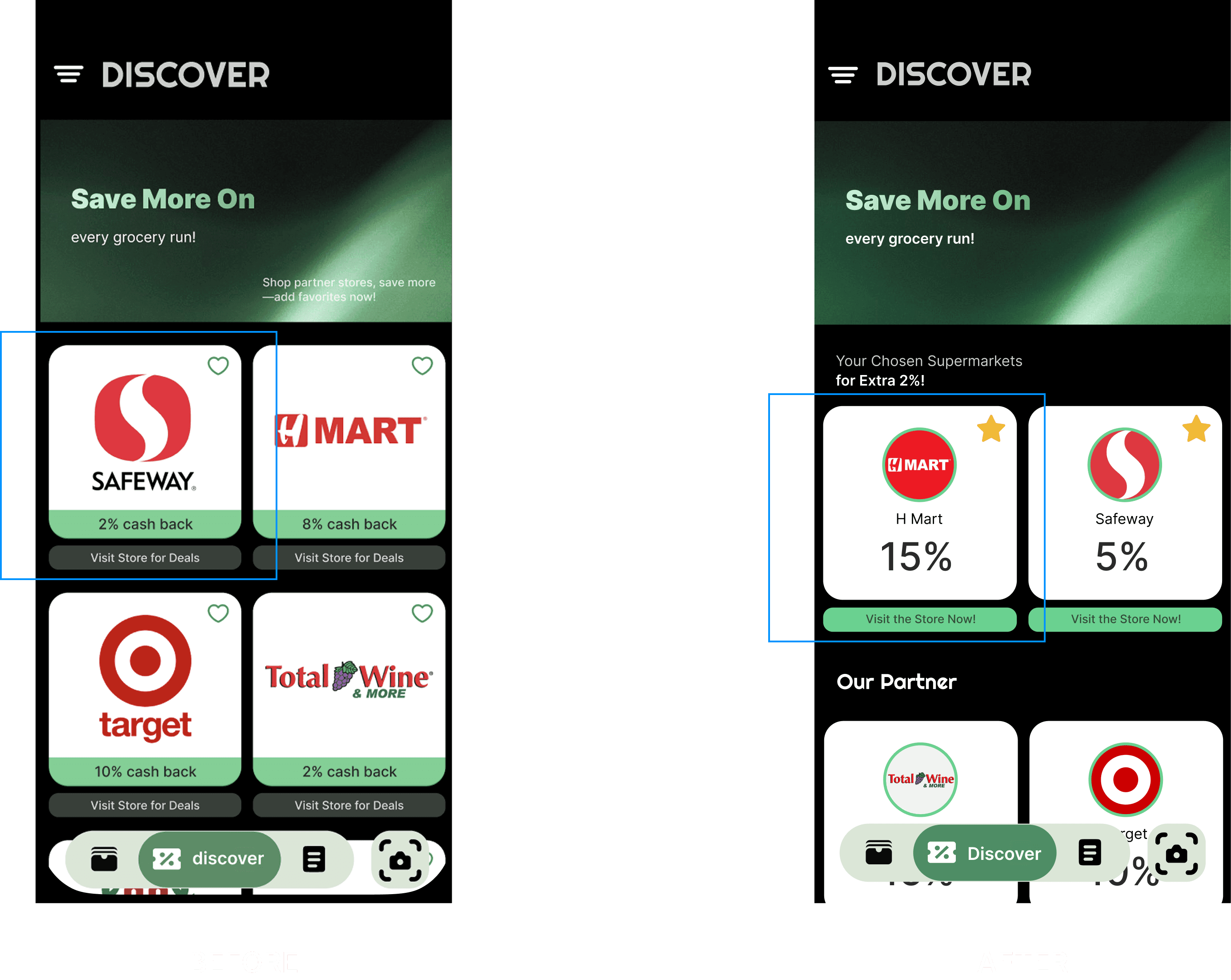
Iteration 3:
Improve Recognition with Clearer Labels
Iteration 3:
Improve Recognition with Clearer Labels
Feedback:
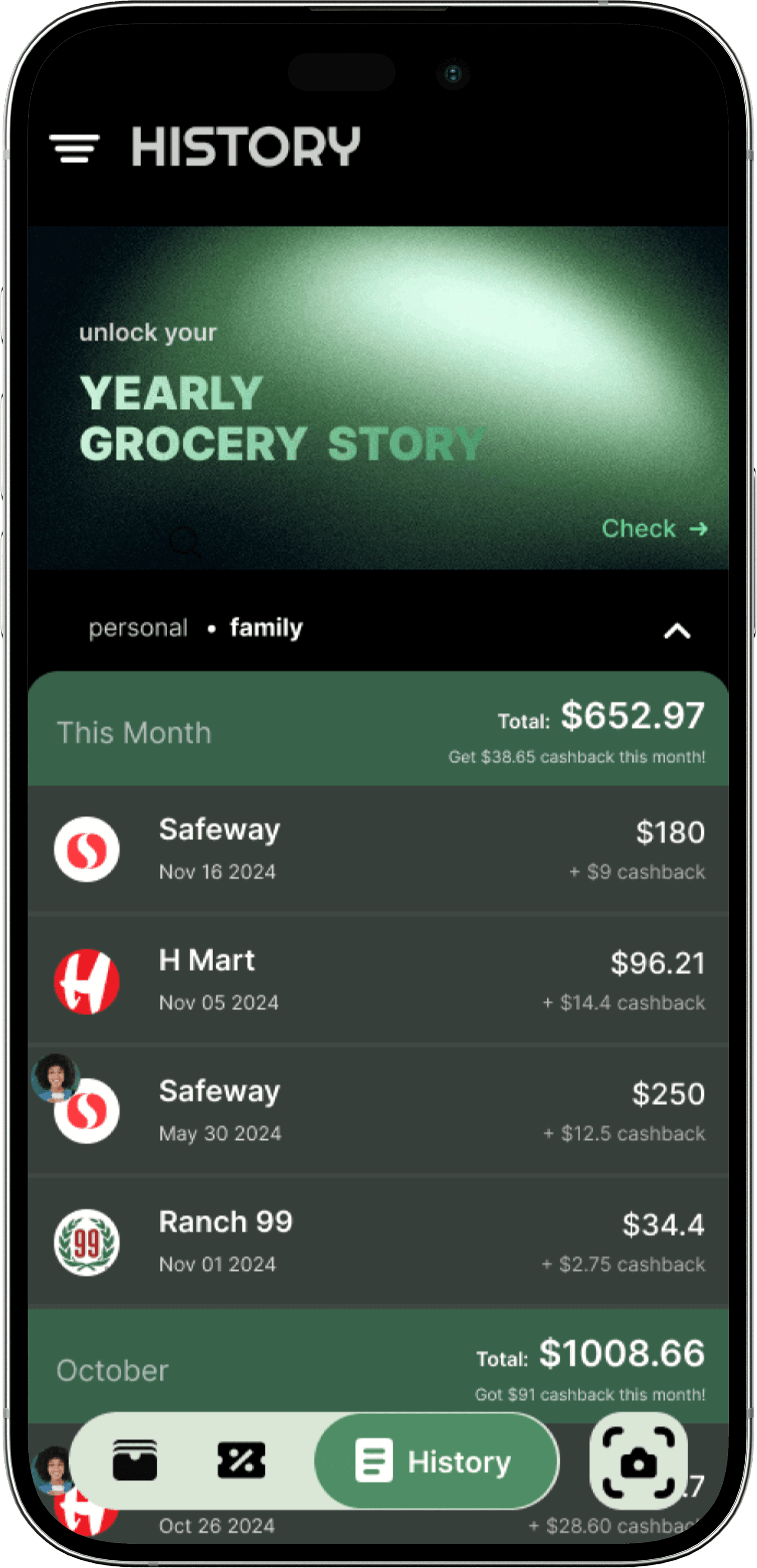
Some users didn’t recognize certain store logos, and missed key cashback rate details.
Feedback:
Some users didn’t recognize certain store logos, and missed key cashback rate details.
Design Change:
Added store names alongside logos and increased visual weight of cashback percentages.
Design Change:
Added store names alongside logos and increased visual weight of cashback percentages.
Result:
100% of users reported faster store recognition and improved clarity in value comparison.
Result:
100% of users reported faster store recognition and improved clarity in value comparison.

Key Takeaways
Key Takeaways
The best product come when we pause, listen, and let users lead the way.
The best product come when we pause, listen, and let users lead the way.
Midway through the project, I realized my initial direction—focused on collecting discounts—was based on misframed research.
Despite already having a tested prototype, I made the call to pivot. It cost time, but the product became significantly stronger as a result.
One of the most important shifts was letting go of my own assumptions. As designers, we’re trained to solve—but in this case, I had to stop solving and start listening.
Much of what shaped the final product came directly from user feedback—often more clearly articulated than I expected. This experience reinforced a lesson I’ve carried throughout my practice: how you frame the problem shapes everything that follows.
Better research questions lead to better insights. And better insights lead to better products.

about the project
Empowering smarter grocery spending
through budgeting and cashback
PennyPal began with a simple observation: despite our efforts to plan grocery trips, my partner and I were consistently overspending—more than $2,000 in one month alone. We weren’t lacking discipline, but we lacked visibility and tools to manage shared expenses effectively.
To validate this, I interviewed 10 individuals with different household setups. Nearly all of them expressed the same frustration: grocery spending felt unpredictable and difficult to control. Existing tools were either store-specific, individual-focused, or too fragmented for shared use.
In high-cost areas like the Bay Area, this isn’t just a personal inconvenience—it’s a broader, underserved need.
PennyPal was designed to address that gap: a shared budgeting tool that helps people track, manage, and stay mindful of everyday grocery spending.
Simplifying household grocery costs
through shared visibility
Two ways to stay in control:
budget it, then earn it back.


Smarter grocery experience
—solo or shared, planned and rewarded
Plan itemized grocery budgets in advance, get spending reminders, and collect withdrawable cashback from partner stores.
Centralizes grocery spending data to support transparency, and collaboration within shared households.
0.2
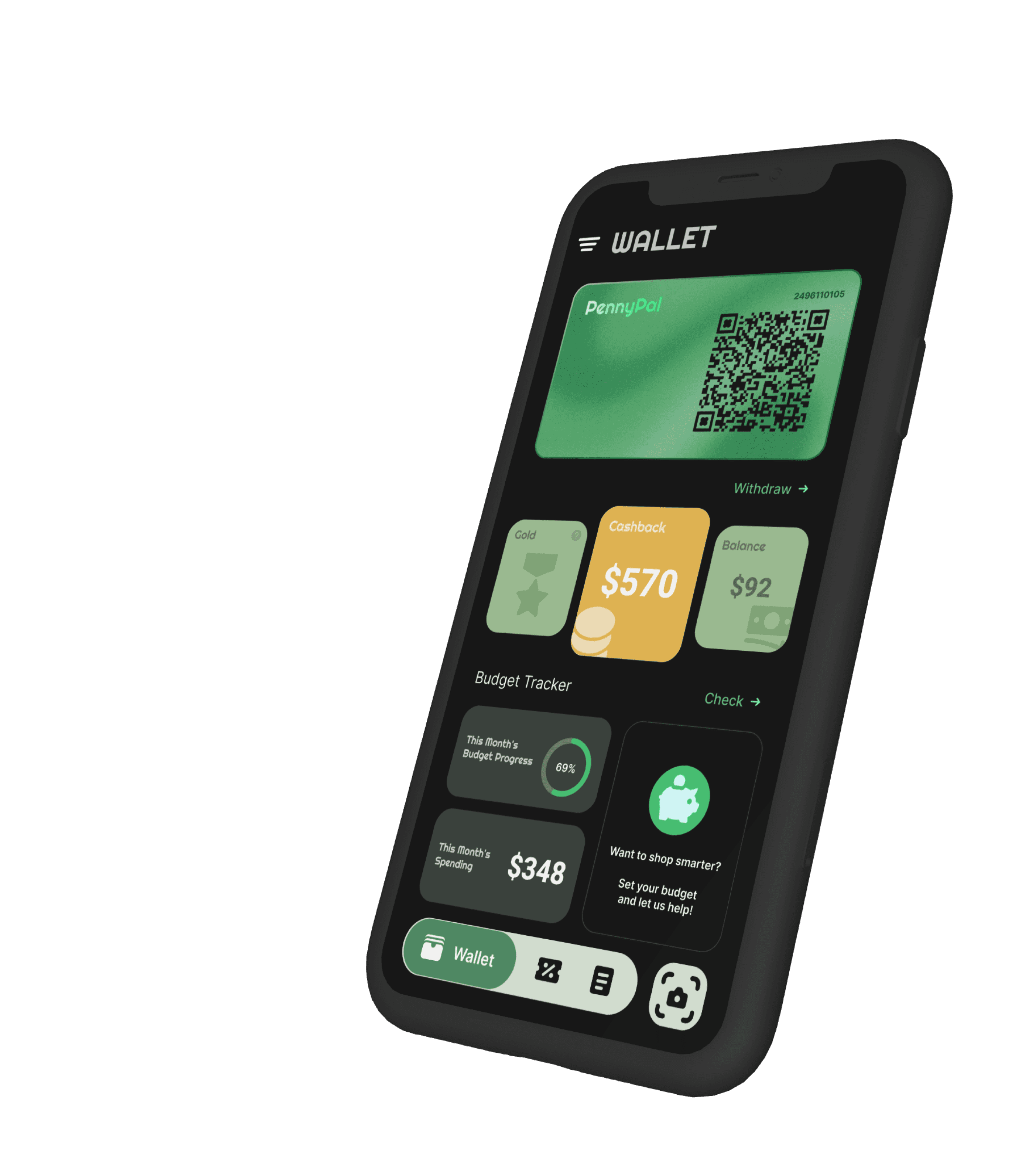
High-Fidelity key-screens
UI Design
0.1
UI Components
0.1
Initial Design
Early on, I assumed that helping people find grocery discounts was the most direct way to reduce overspending.
That assumption shaped my initial survey—many of the questions focused on discount behavior, rather than leaving space for open-ended insights.
Unsurprisingly, users responded in kind: most said they wanted easier ways to access deals, which led me to explore a discount aggregator concept.
UX Research
Early exploration focused on aggregating grocery discounts—based on the assumption that saving money started with finding better prices. But once usability testing began, it became clear: price wasn’t the core issue.
Users weren’t overwhelmed by a lack of deals.
They were overwhelmed by a lack of visibility, shared tracking, and spending structure.
This shifted the design focus entirely—from helping people spend less, to helping them understand and manage how they spend.
Rethinking the Real Problem
0.2
Pivoted The Focus
0.3
Second Interview Takeaways
People struggle to...
avoid impulse purchases.
manage shared expenses with roommates or family.
keep track of receipts and item-level spending.
People Need...
an all-in-one tool to set budgets, receive alerts, and track spending.
a unified way to track purchases across supermarkets.
a shared platform to manage and review household grocery expenses.
shop smarter and get the most value out of every purchase.
0.2
Main Function
UX Design
0.1
Prioritisation
With the end of the research phase, it was time to define the essential needs for PennyPal and prioritize the core features to develop. I first aligned both business and user goals. The common ground between them can be summarized into three key points:
Help users stay within their grocery budgets effortlessly
Provide a seamless platform for both personal and family expense management
Build long-term engagement through smart cashback rewards and spending insights
Project Goals
Personal Grocery Spending Management.
The flow covers setting a monthly grocery budget and tracking past supermarket spending through electronic records.
0.3
Supporting Features
Family Grocery Budget Management.
The flow covers switching between personal and household views to manage shared grocery expenses.
Cashback Management and Withdrawal.
The flow covers viewing earned cashback and withdrawing through preferred methods.
Overspending Alerts & Notifications
The flow covers system-generated reminders when users exceed their monthly grocery budget, helping them stay financially aware.
Manual Receipt Upload
The flow covers uploading a receipt photo when QR scan was missed, turning it into a digital grocery bill for record-keeping.
Usability Test
0.2
Iterations
Iteration 1:
Simplify Data View with User-Controlled Toggle
Feedback:
Over 65% of users found the budget overview screen visually overwhelming—citing difficulty focusing due to too much data shown at once.
Result:
78% of users reported reduced cognitive load and improved ability to focus on relevant information, especially during quick check-ins.

Design Change:
Introduced a detail toggle in the chart, allowing users to expand or collapse data based on preference.
Iteration 2:
Prioritize Cashback Visibility Through Visual Hierarchy
Feedback:
Over 70% of users overlooked key cashback details—reporting they “missed the most important part” due to poor visual hierarchy.
Result:
95% of users immediately noticed the cashback section post-change. Visual prioritization improved comprehension and next-step clarity.
Design Change:
Reworked the layout by elevating cashback info on a bold gold card, de-emphasizing secondary elements like membership tier, and adding clearer CTA buttons.
Iteration 3:
Improve Recognition with Clearer Labels
Feedback:
Some users didn’t recognize certain store logos, and missed key cashback rate details.
Result:
100% of users reported faster store recognition and improved clarity in value comparison.
Design Change:
Added store names alongside logos and increased visual weight of cashback percentages.
Key Takeaways
The best product come when we pause, listen, and let users lead the way.
Midway through the project, I realized my initial direction—focused on collecting discounts—was based on misframed research.
Despite already having a tested prototype, I made the call to pivot. It cost time, but the product became significantly stronger as a result.
One of the most important shifts was letting go of my own assumptions. As designers, we’re trained to solve—but in this case, I had to stop solving and start listening.
Much of what shaped the final product came directly from user feedback—often more clearly articulated than I expected. This experience reinforced a lesson I’ve carried throughout my practice: how you frame the problem shapes everything that follows.
Better research questions lead to better insights. And better insights lead to better products.